

In this post, I’d like to explore a sample data set using Kibana.
This requires some data to start with: let’s index some tweets. It’s quite straightforward to achieve that by following explanations found in my good friend David’s blog post and wait for some time to fill the index with data.
Basic metric
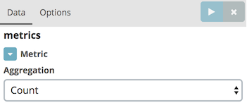
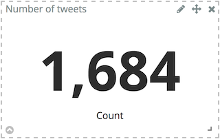
Let’s start with something basic, the number of tweets indexed so far.
In Kibana, go to , then choose the twitter index. For the Aggregation field, choose "Count"; then click on Save and name the visualization accordingly e.g. "Number of tweets".
Geo-map
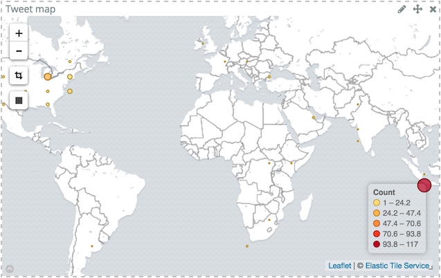
Another simple visualization is to display the tweets based on their location on a world map.
In Kibana, go to , then choose the twitter index.
Select Geo Coordinates for the bucket type and keep default values,Geohash for Aggregation and coordinates.coordinates for Field.
Bucket metric
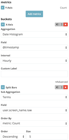
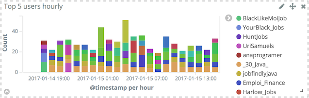
For this kind of metric, suppose a business requirement is to display the top 5 users. Unfortunately, as some (most?) business requirements go, this is not deterministic enough. It misses both the range and the aggregation period. Let’s agree for range time to be a sliding window over the last day, and the period to be an hour.
In Kibana, go to , then choose the twitter index. Then:
- For the Y-Axis, keep
Countfor the Aggregation field - Choose X-Axis for the buckets type
- Select
Date histogramfor the Aggregation field - Keep the value
@timestampfor the Field field - Set the Interval field to
Hourly
- Select
- Click on Add sub-buckets
- Choose Split bars for the buckets type
- Select
Termsfor the Sub Aggregation field user.screen.namefor the Field field- Keep the other fields default value
- Select
- Don’t forget to click on the Apply changes
- Click on Save and name the visualization accordingly e.g. "Top 5 users hourly".
Equivalent visualisations
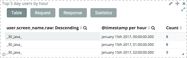
Other visualizations can be used with the exact same configuration: Area chart and Data table.
The output of the Area chart is not as readable, regarding the explored data set, but the Data table offers interesting options.
From a visualization, click on the bottom right arrow icon to display a table view of the data instead of a graphic.
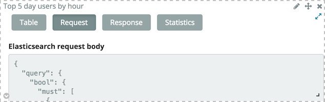
Visualizations make use of Elasticsearch public API. From the tabular view, the JSON request can also be displayed by clicking on the Request button (oh, surprise…). This way, Kibana can be used as a playground to quickly prototype requests before using them in one’s own applications.
Changing requirements a bit
The above visualization picks out the 5 top users having the most tweeted during each hour and display them during the last day. That’s the reason why there are more than 5 users displayed. But the above requirement can be interpreted in another way: take the top 5 users over the course of the last day, and break their number of tweets by hour.
To do that, just move the X-Axis bucket below the Split bars bucket. This will change the output accordingly.
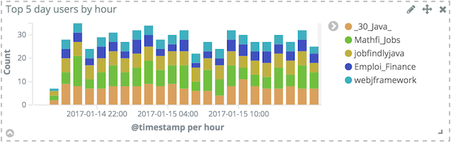
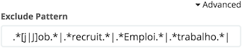
Filtering irrelevant data
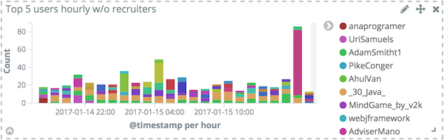
As can be seen in the above histogram, top users mostly are about recruiting and/or job offers. This is not really what is wanted in the first place. It’s possible to remove this noise by adding a filter: in the Split bars section, click on Advanced to display additional parameters and type the desired regex in the Exclude field.
The new visualization is quite different:
Putting it all together
With the above visualizations available and configured, it’s time to put them together on a dedicated dashboard. Go to to list all available visualizations.
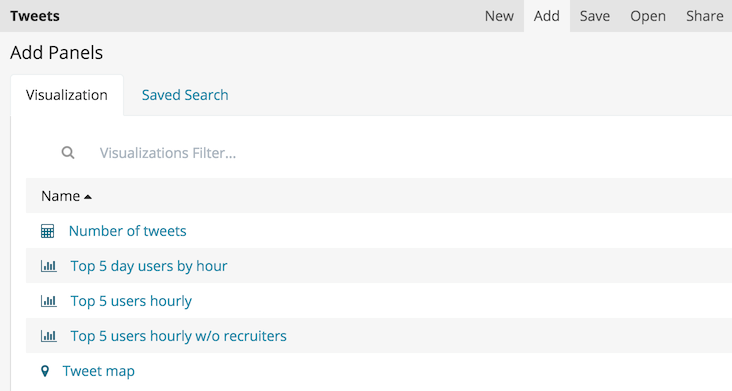
It’s as simple as clicking on the desired one, laying it out on the board and resetting its size. Rinse and repeat until happy with the result and then click on Save.
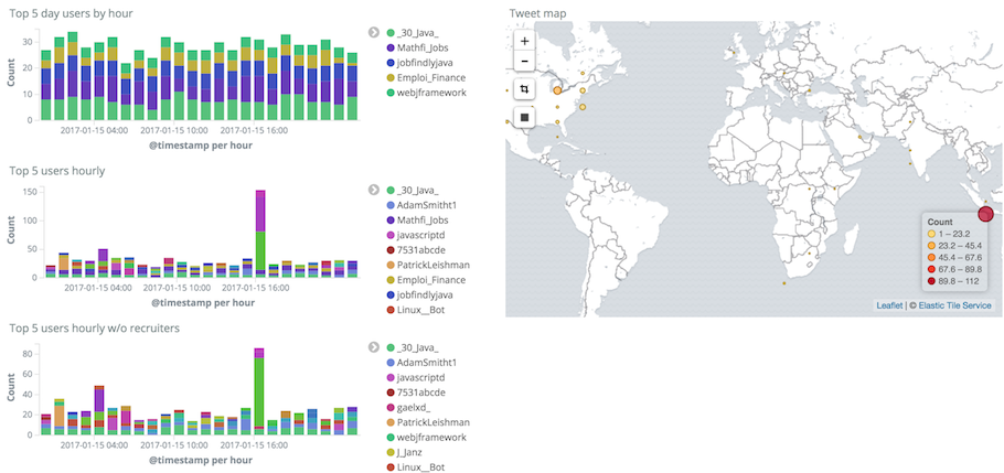
Icing on the cake, using the Rectangle tool on the map visualization will automatically add a filter that only displays data bound by the rectangle coordinates for all visualizations found on the dashboard.
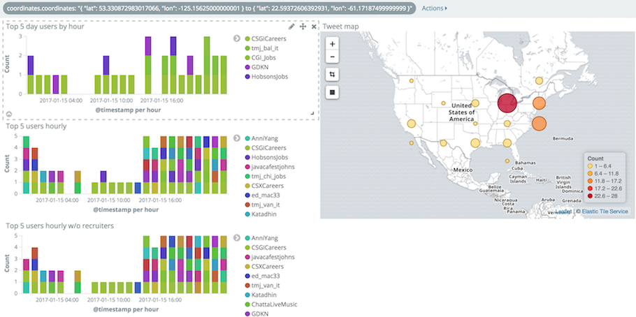
That trick is not limited to the map visualization (try playing with other ones) but filtering on location quickly gives insights when exploring data sets.
Conclusion
While this post only brushes off the surface of what Kibana has to offer, there are more visualizations available as well as Timelion, the new powerful (but sadly under-documented) the "time series expression interface". In all cases, even basic features as shown above already provide plenty of different options to make sense of one’s data sets.